
All the teams’ new challengers have now been launched – or at least the liveries have, with as little as possible given away in terms of their actual design.
So, as ever, there’s not a huge amount to garner from these launches but let’s at least talk about how pretty (or not, or familiar) the new liveries are and look for any significant design tweaks.
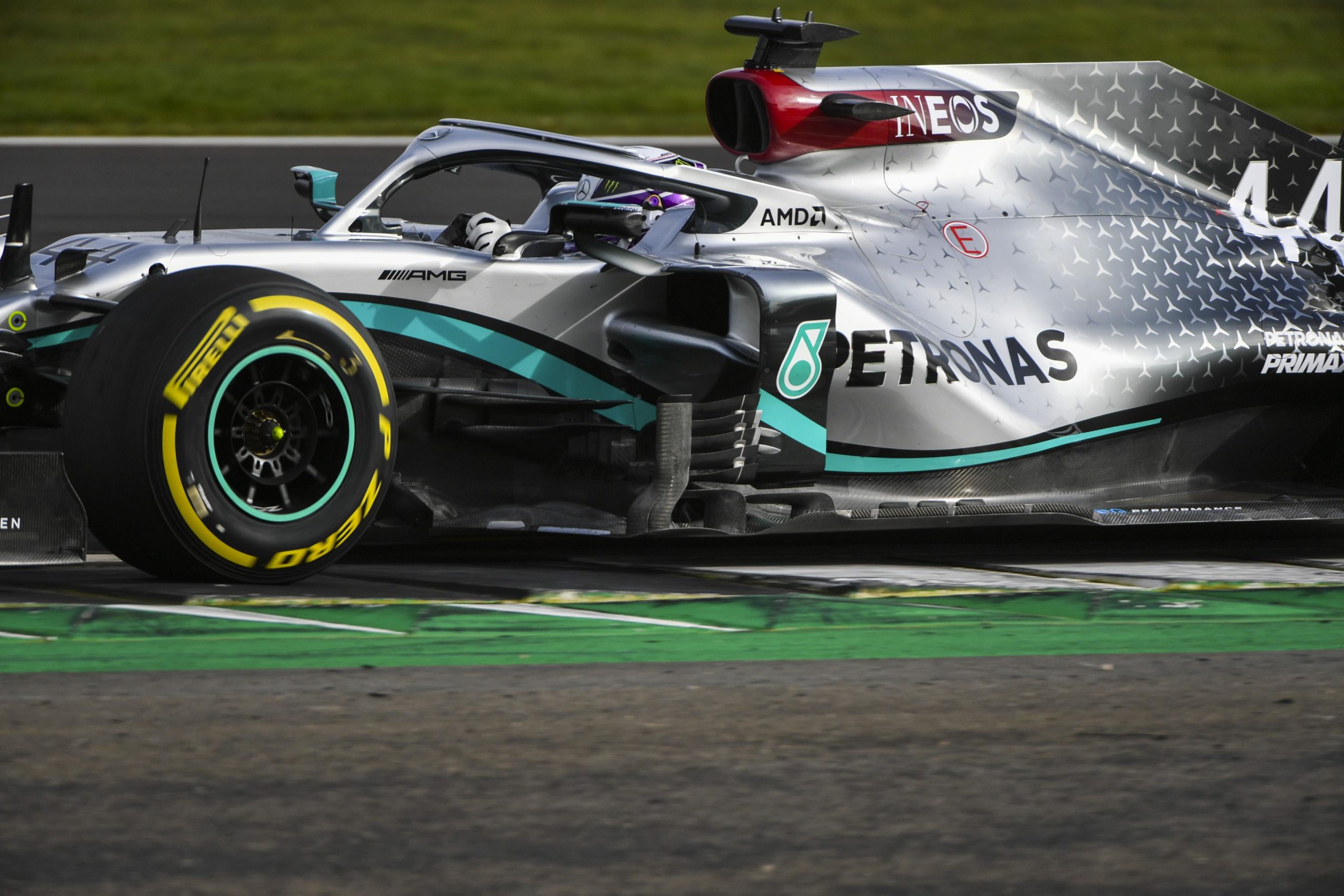
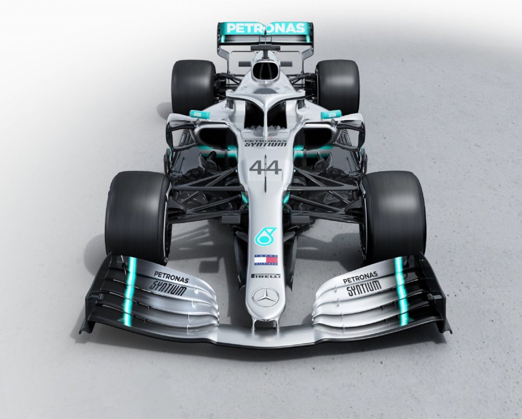
Mercedes-AMG Petronas Formula One Team
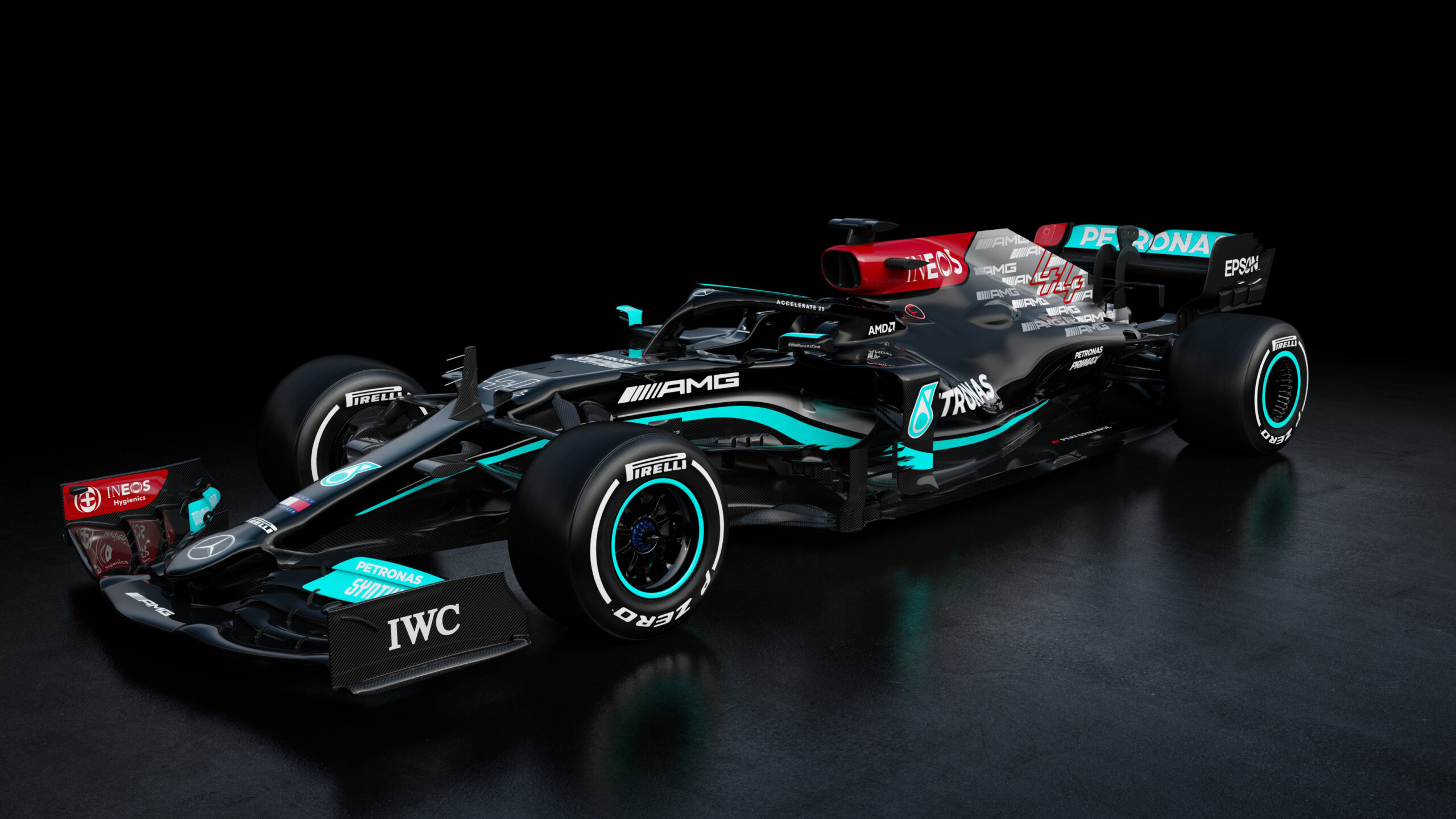
Mercedes stick with a black arrow for one more season, but have removed the sea of stars that adorned the rear of the engine cover on the last two cars. They have, in fact, been replaced by a sea of AMGs…
Whilst that has proved somewhat unpopular, the rest of the car is as sleek as ever. There is an increased presence of INEOS red, in line with their increased stake in the team, which makes the entire livery feel more together than last year’s. The font of the driver numbers has also finally been changed from what appeared to be default Arial in recent years.
Predictably Mercedes have revealed none of the tricks they may have up their sleeve this year – remember that they started work on this car earlier than any other team – so let’s see what car arrives at the pre-season tests…
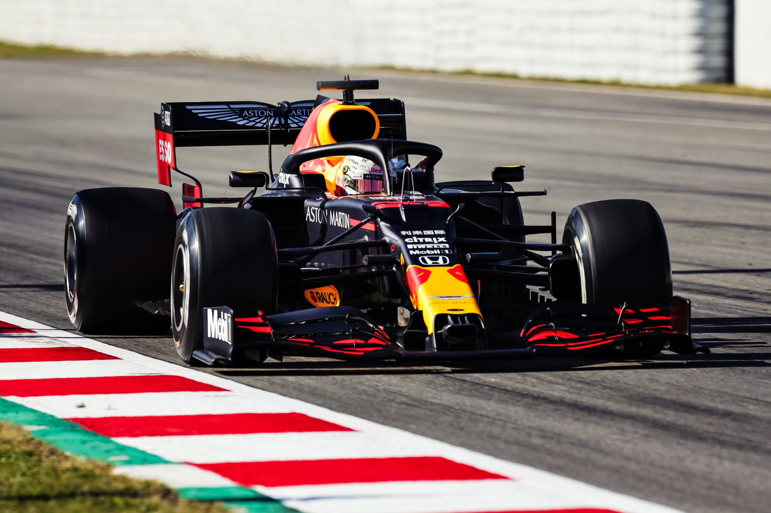
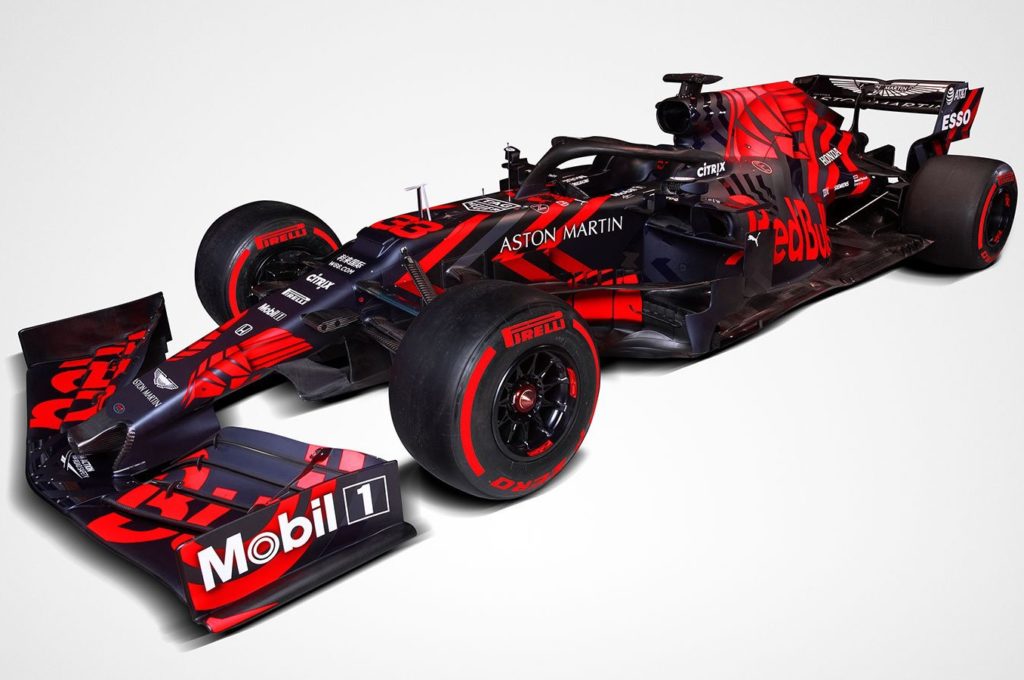
Red Bull Racing Honda
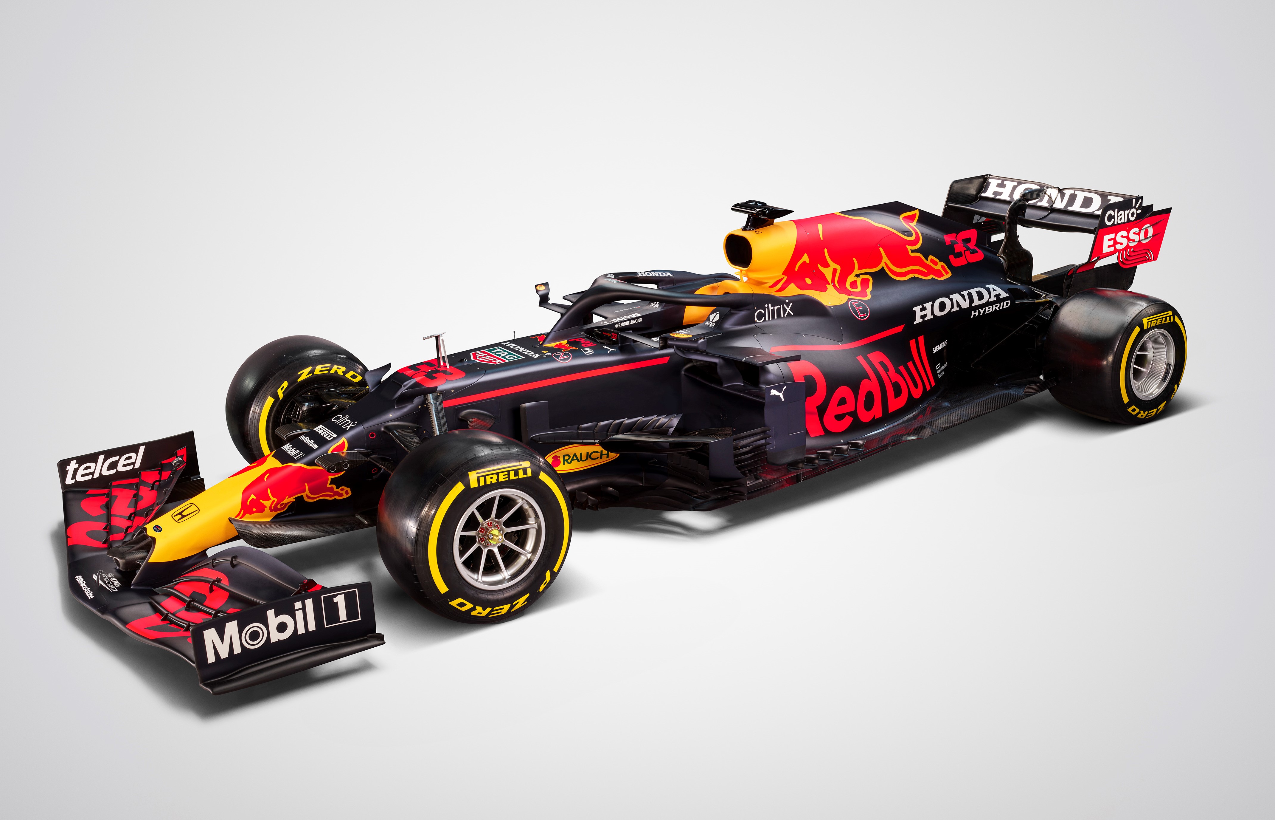
It’s yet another Ctrl+C, Ctrl+V job from Red Bull. Whilst it’s still a nice livery, it would have been nice to see a bit of a change. Perhaps they could have leaned a bit harder on the Red Bull yellow now that Renault have left that spot on the F1 colour wheel vacant.
There is some intense bargeboard work going on in the release photos, but Red Bull have often put something on the car to draw the eye at launch day only for it to disappear by the first test. So, let’s take that with a pinch of salt.
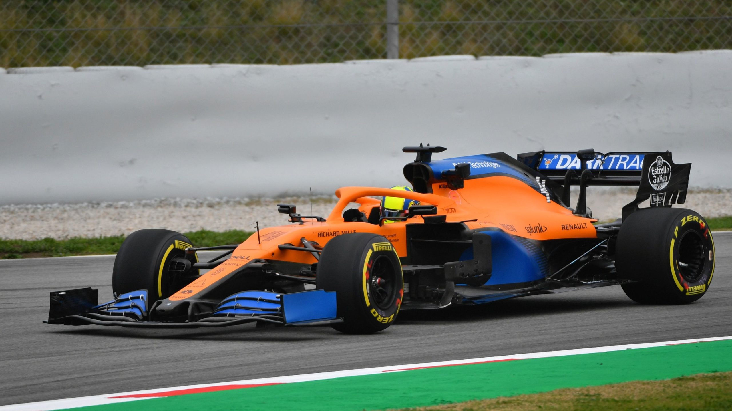
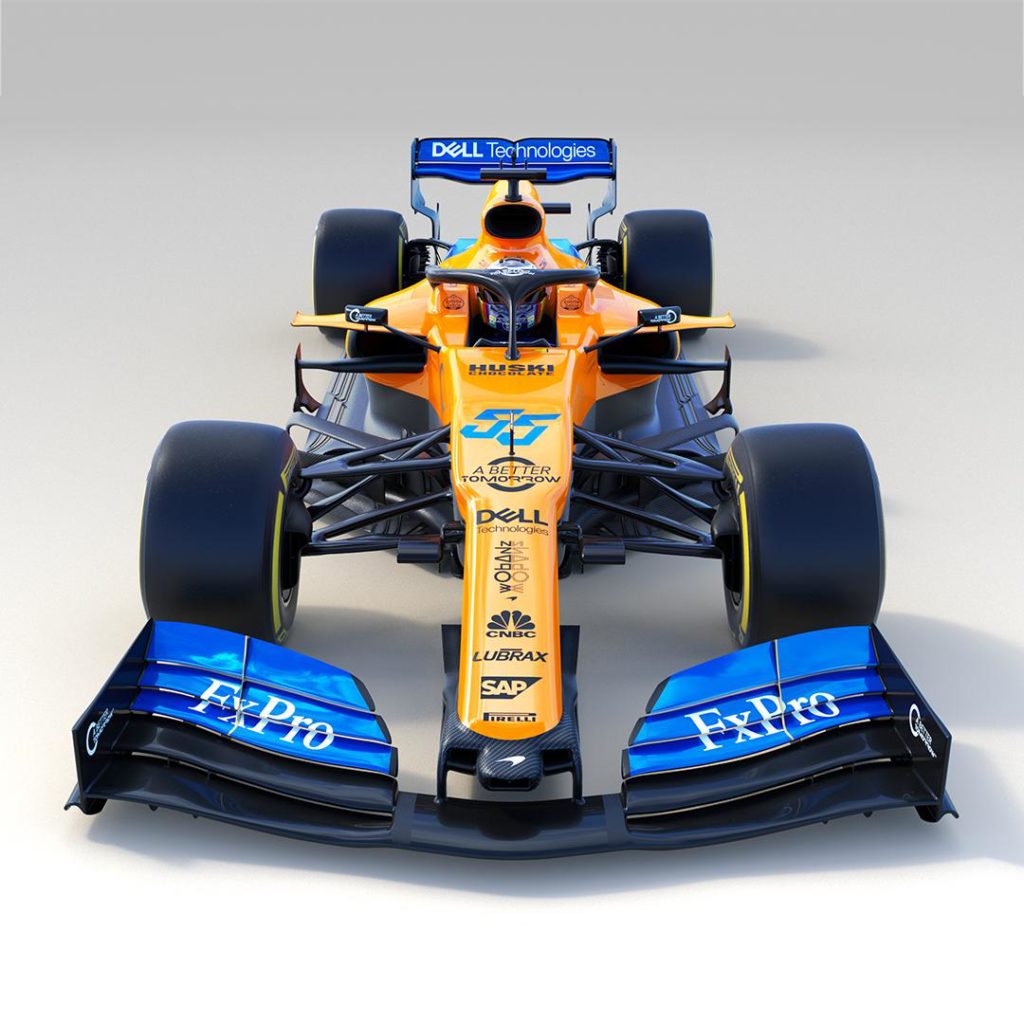
McLaren F1 Team
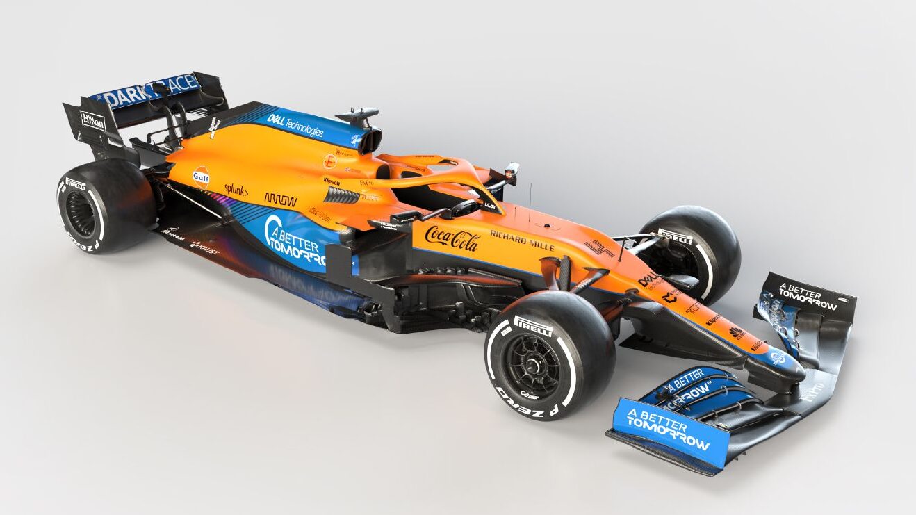
Bar a tiny bit of extra blue on the nose, the MCL35M is a carbon copy of the MCL35 in terms of livery. However, that ‘M’ is very significant and means that McLaren have likely had the biggest change in car over the winter.
That’s because that ‘M’ stands for Mercedes. McLaren have left Renault behind and the difference it has made to their aerodynamics around the power unit are huge. The cumbersome Renault engine took up a lot of space but the MCL35M’s engine cover is narrower even than last year’s Mercedes. If the Mercedes power pushes McLaren forward in the manner than many expect, they could well be challenging for regular podiums.
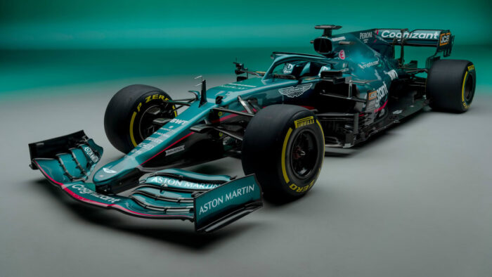
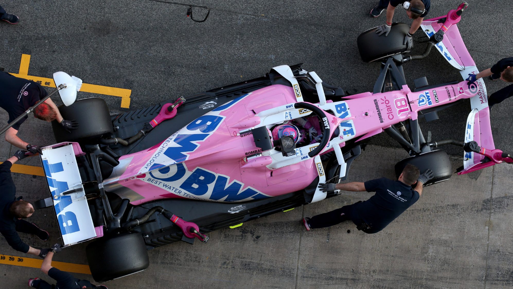
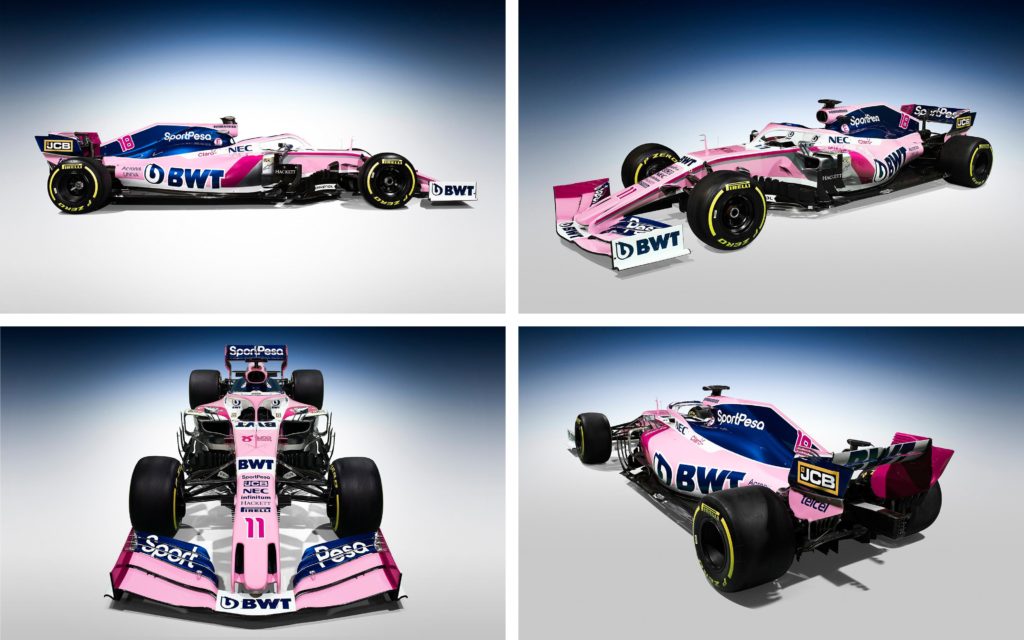
Aston Martin Cognizant Formula One Team

Aston Martin are finally back – and so is British racing green! Once the deal with BWT was announced, many feared the pink linked with their sponsorship would produce some kind of watermelon monstrosity. But the designers have, in fact, succeeded in combining the two elegantly.
It is deeper shade of pink and kept to just a couple of accents which surprisingly compliment the green. The rest of the design is very simple – one could argue unambitious – but the colour is the main attraction and looks predictably stunning in natural light. Will last year’s ‘Pink Mercedes’ be as successful as a ‘Green Mercedes’?
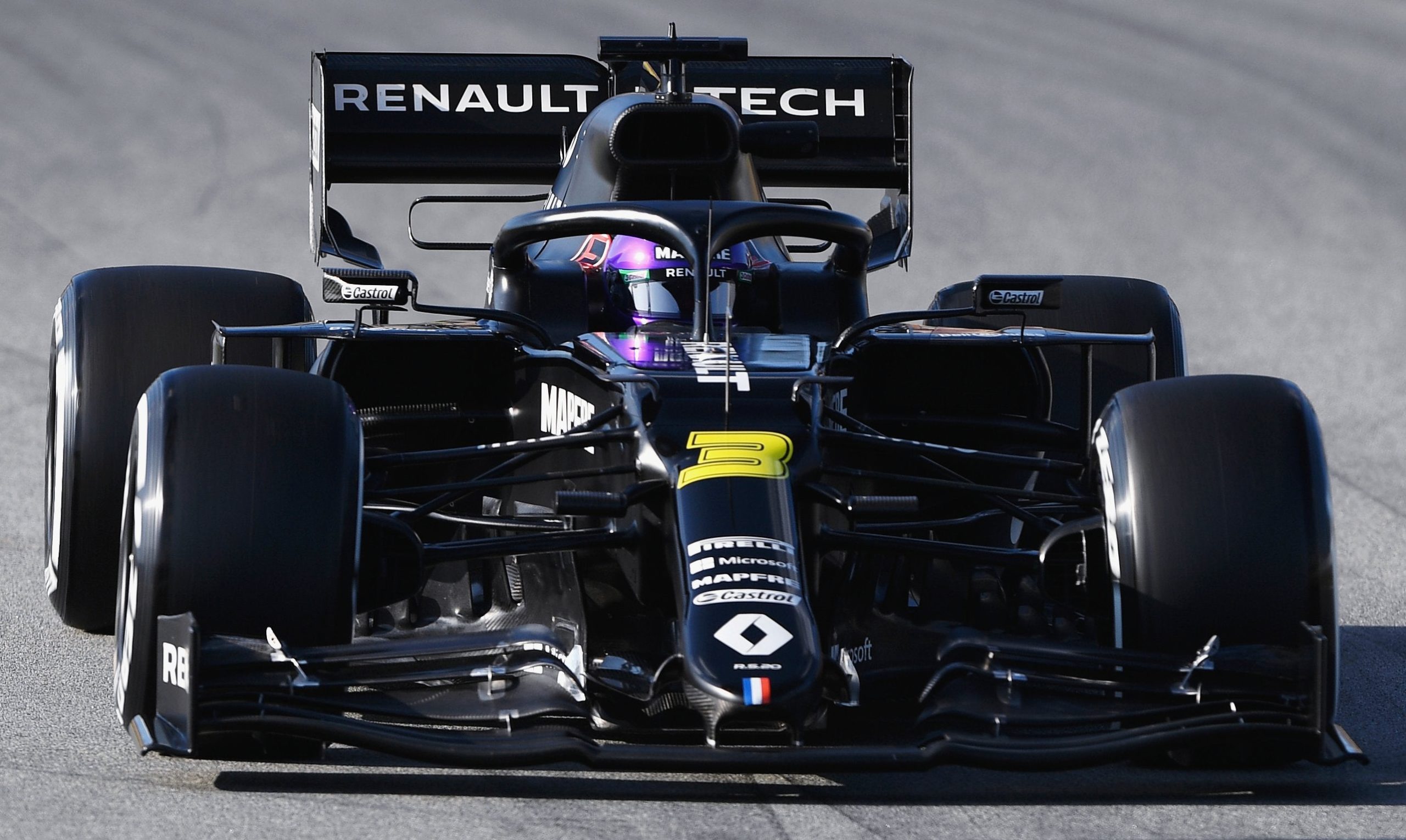
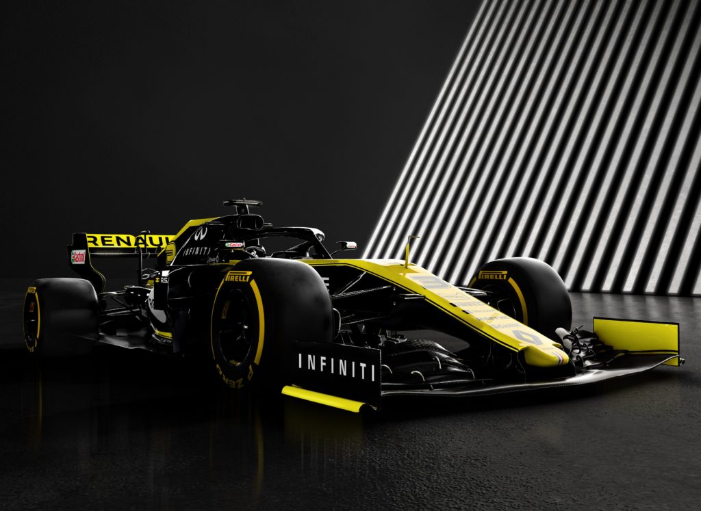
Alpine F1 Team
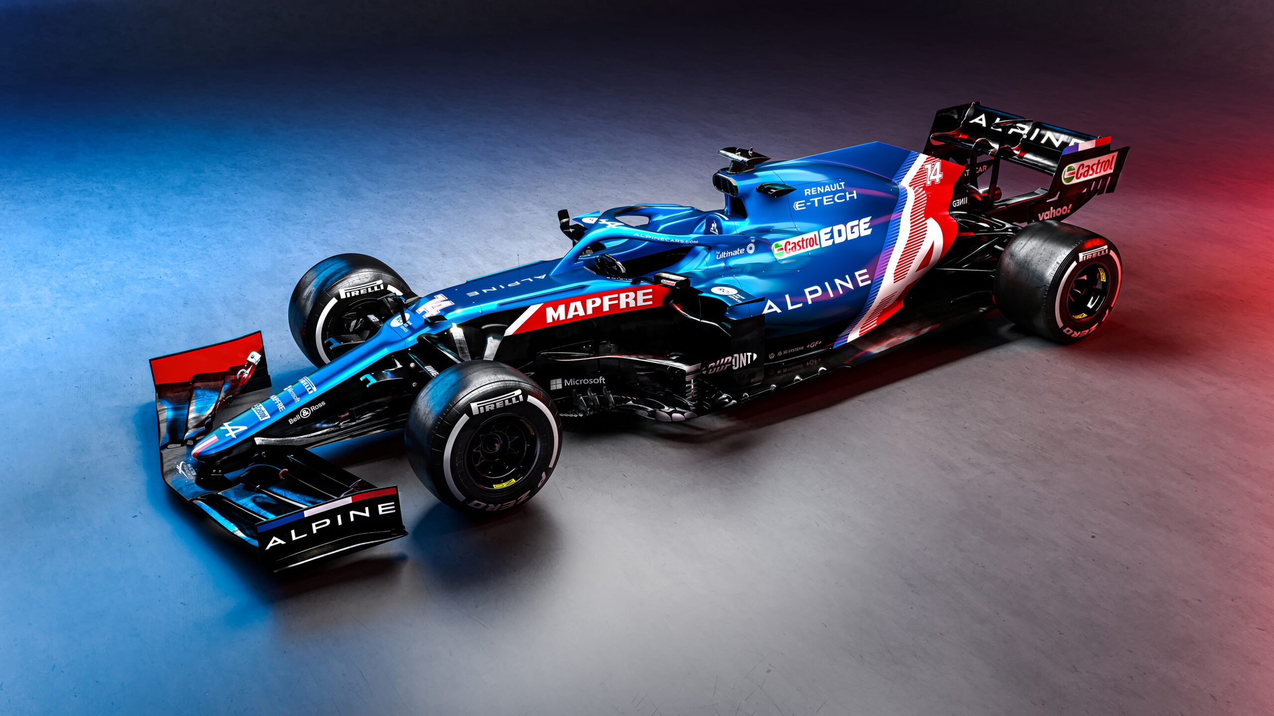
Onto another rebrand; this one with a distinctly French feel. The traditional Renault yellow has sadly gone from the grid, but the Alpine livery has turned out to be stunning. A metallic, electric blue, combined with a simple Tricolore effect towards the back is elegant but striking.
With a Renault engine underneath, the Alpine still has a distinctly wider engine cover than the rest of the grid. However, if the engine has been improved and can help move them closer to the top end of the field, they won’t mind one bit. They certainly won’t want Fernando discussing GP2 engines over the radio again.
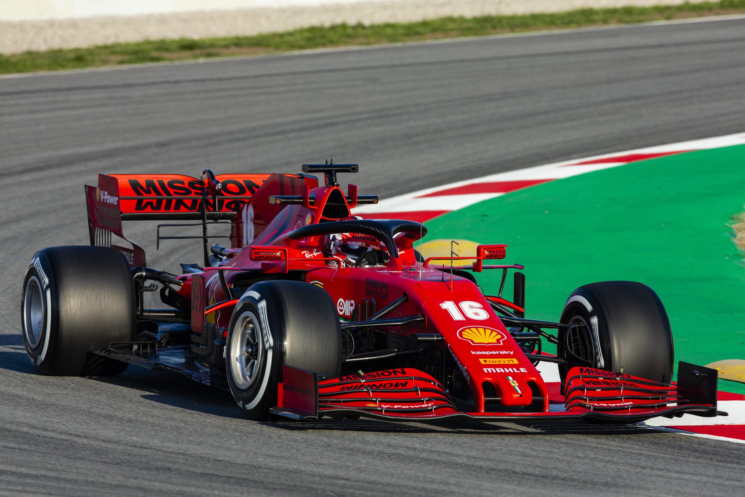
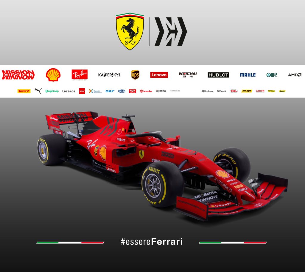
Scuderia Ferrari Mission Winnow
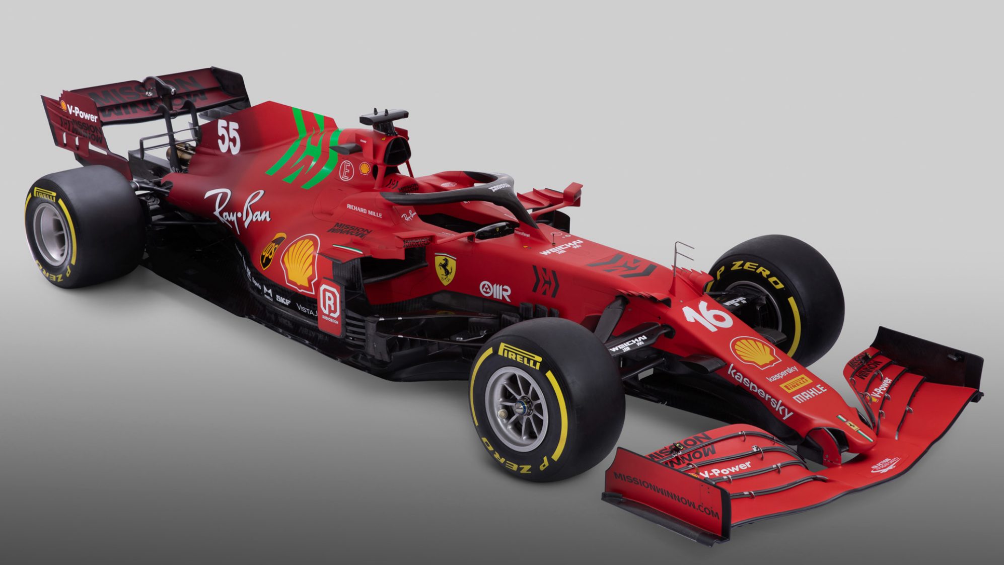
Shockingly, it’s not just red! Usually the most predictable launch of the year, Ferrari have gone more controversial for 2021. With a fade towards a darker shade of red at the back and a real curveball with a green Mission Winnow logo on the engine cover.
There are some interesting ideas but the execution seems slightly off – a white border around the green would likely have made it clash less. Not that the green logo is all that important in the grand scheme of things as Mission Winnow is banned in most of the Western world and will likely be gone after the Bahrain Grand Prix.
The nose has changed significantly as Ferrari move in the direction the rest of the field has already pursued and the Scuderia will have all their fingers crossed that the engine has been significantly improved so that they can claw back some performance after last year’s embarrassment. The new livery was leaked by a ‘hacker’ who set their computer clock ahead…so it’s not been the best start.
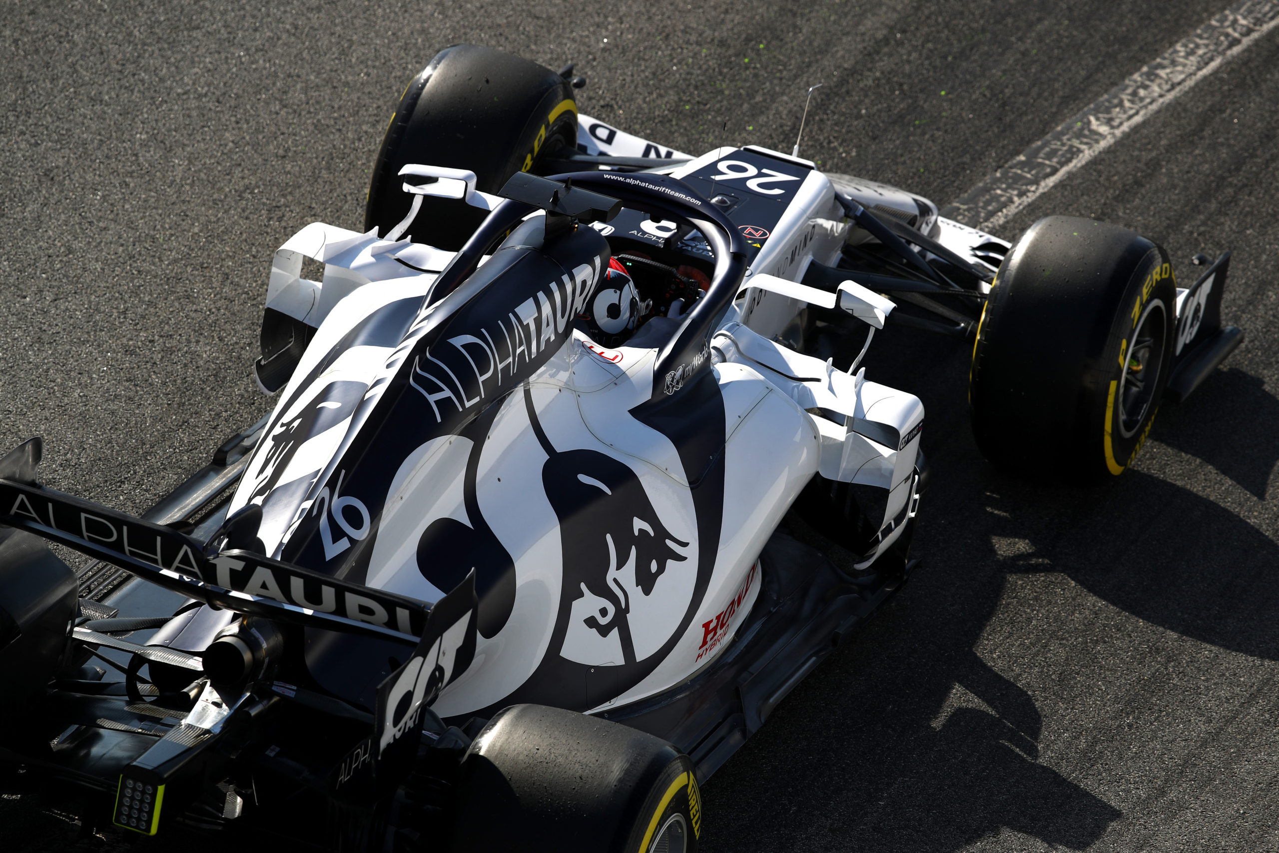
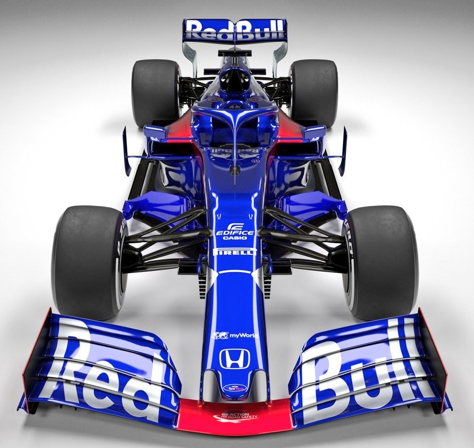
Scuderia AlphaTauri Honda
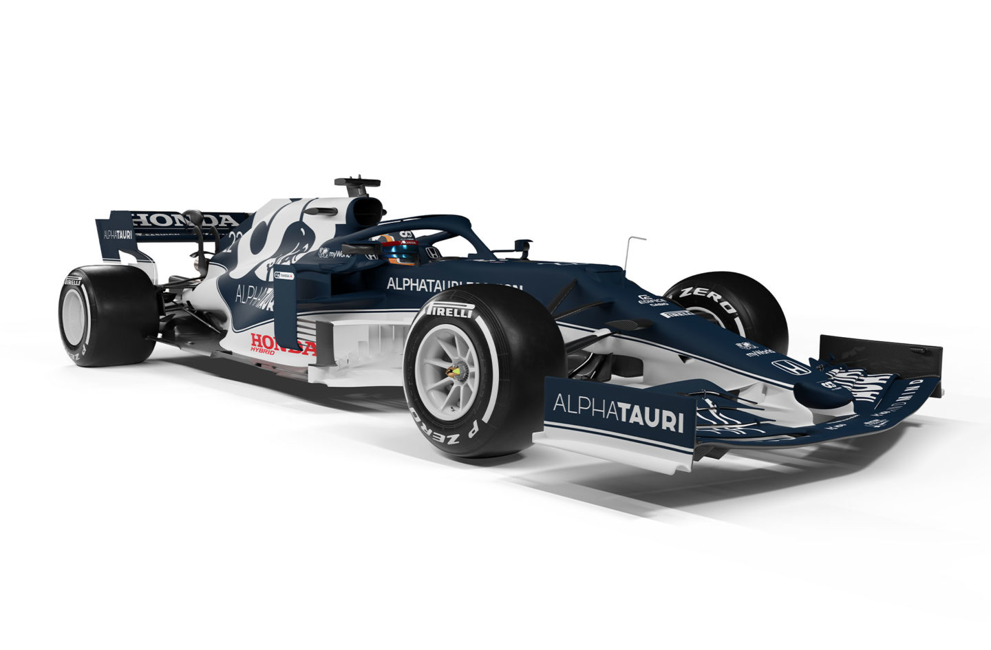
The team formerly known as Toro Rosso (and Minardi, of course) have produced another decent livery. It is similar to their design from last year but with the navy blue to white ratio skewed towards the former.
AlphaTauri have also used their allotted development tokens to redesign the nose. Whilst the official release images show last year’s nose, the team tested at Imola a few days later with a noticeably more slender design.
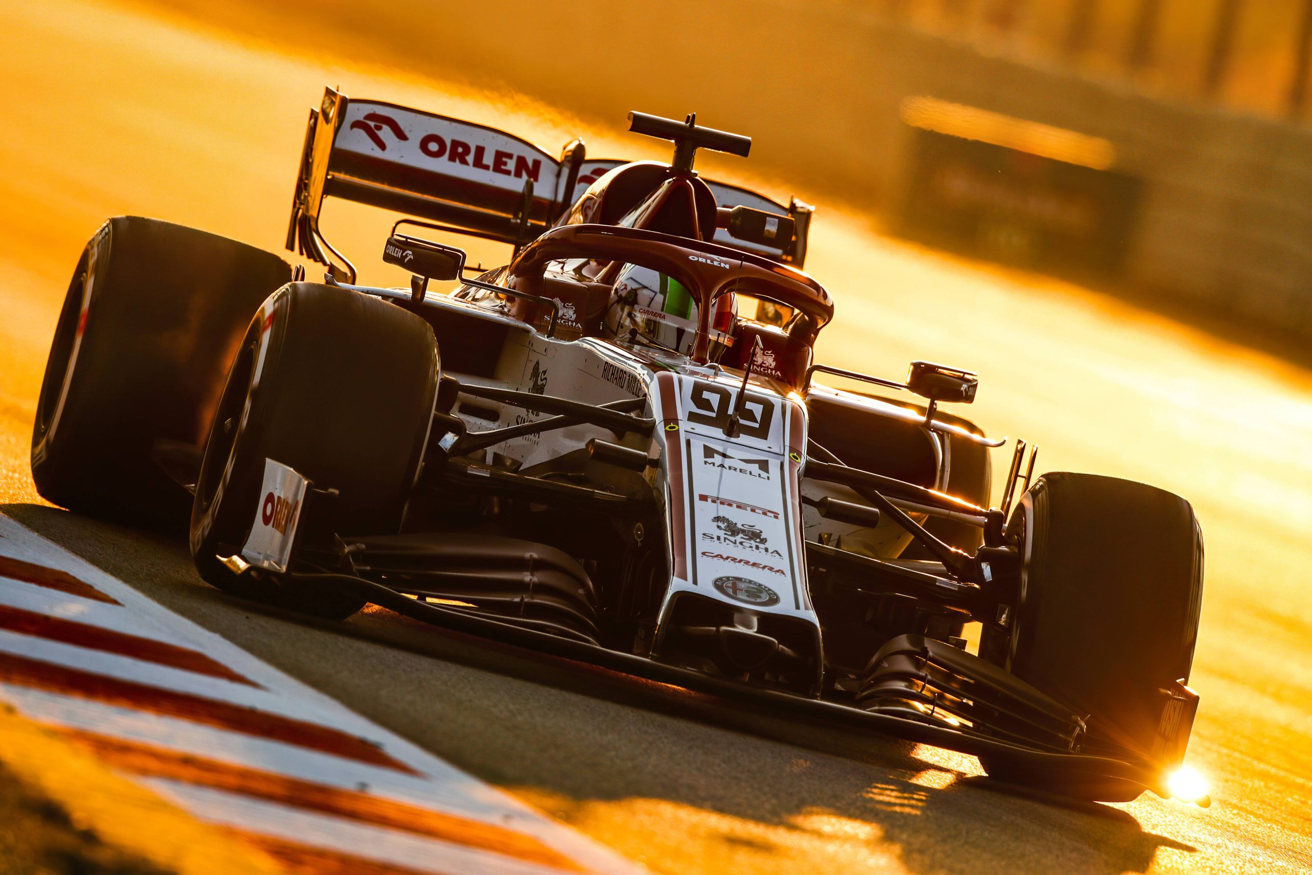
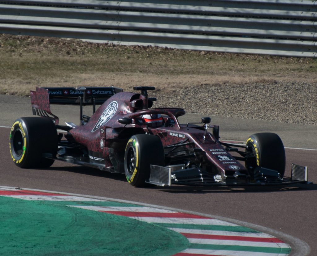
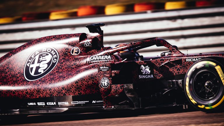
Alfa Romeo Racing Orlen
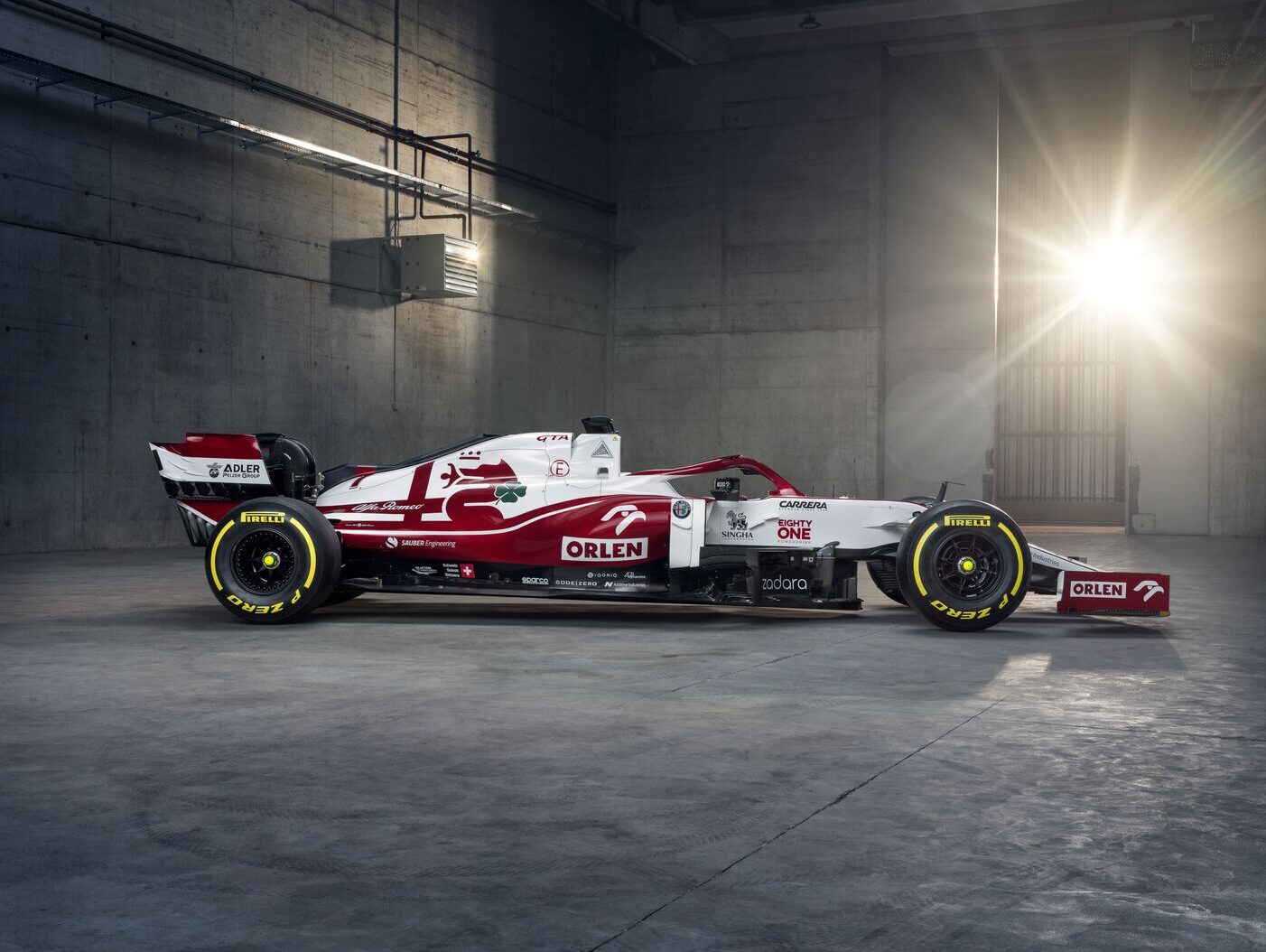
Seemingly one of the Alfa Romeo designers accidentally hit ‘invert’ on last year’s livery and then decided it actually looked pretty good. And, in fairness, it does. It oozes that Alfa Romeo class and the green quadrifoglio added to the engine cover is also a nice touch.
They have added some interesting design features to the front of the car; the purpose of which I won’t claim to understand just yet, but will likely be hypothesised by Ted Kravitz as some point during the Sky testing coverage.
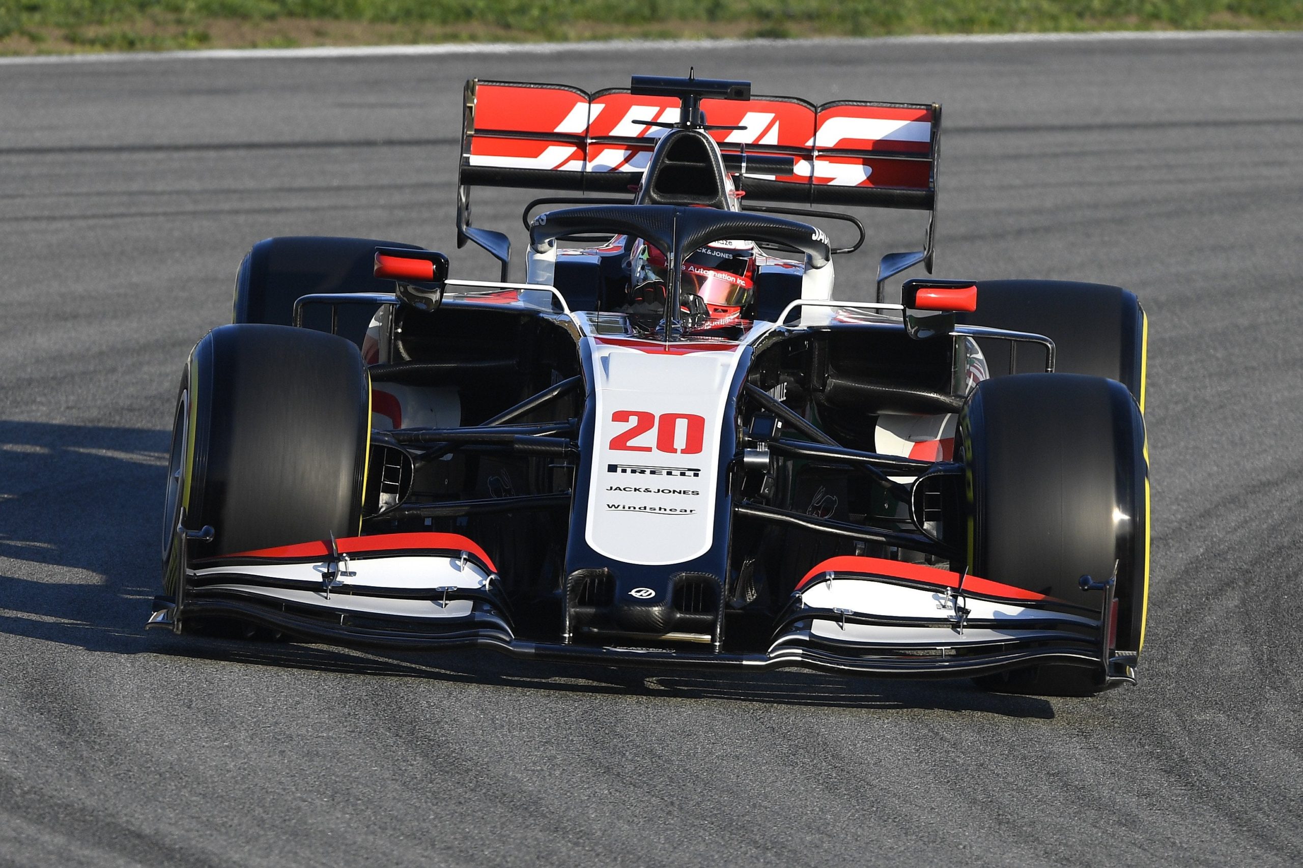
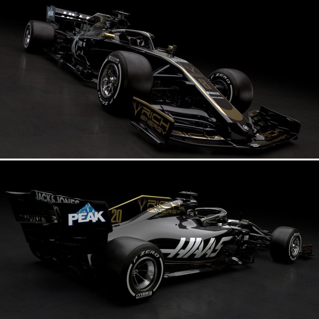
Uralkali Haas F1 Team
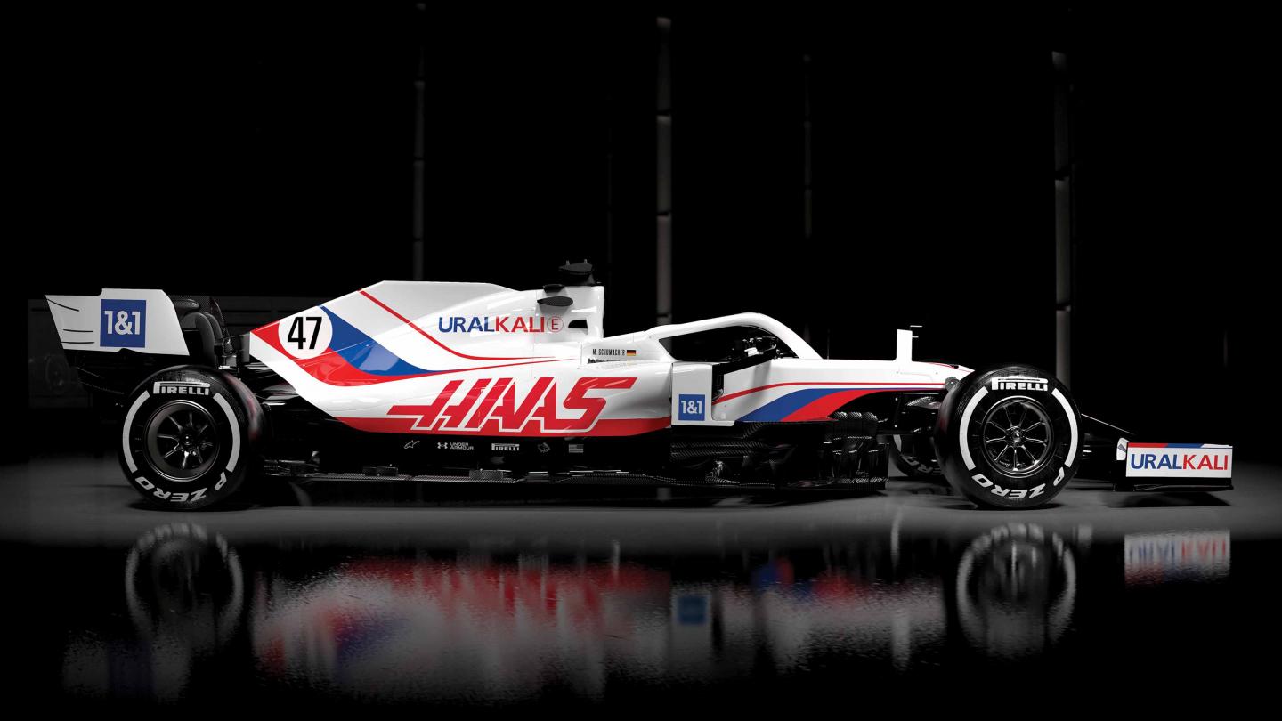
Well then. Formula 1’s ‘American’ team is now effectively sporting a shiny, Russian flag. Since their arrival in 2015, Haas have resisted the temptation to produce any kind of stars and stripes livery, sticking to their traditional brand colours of grey and red. But then in came the controversial Mazepin family.
Rookie driver Nikita received backlash for a series of misdemeanours – both on track and off track – and many are pushing the #WeSayNoToMazepin movement. It appears, though, that he is going nowhere, largely thanks to Haas’s desperation for his father’s Uralkali funding. It would not be a surprise to see the Russian oligarch buy out the team within the next couple of years.
There is added irony in that Mazepin will not be allowed to race under the Russian flag, thanks to the CAS ruling on Russian doping. Apparently he is allowed to drive in a big, Russian flag, however.
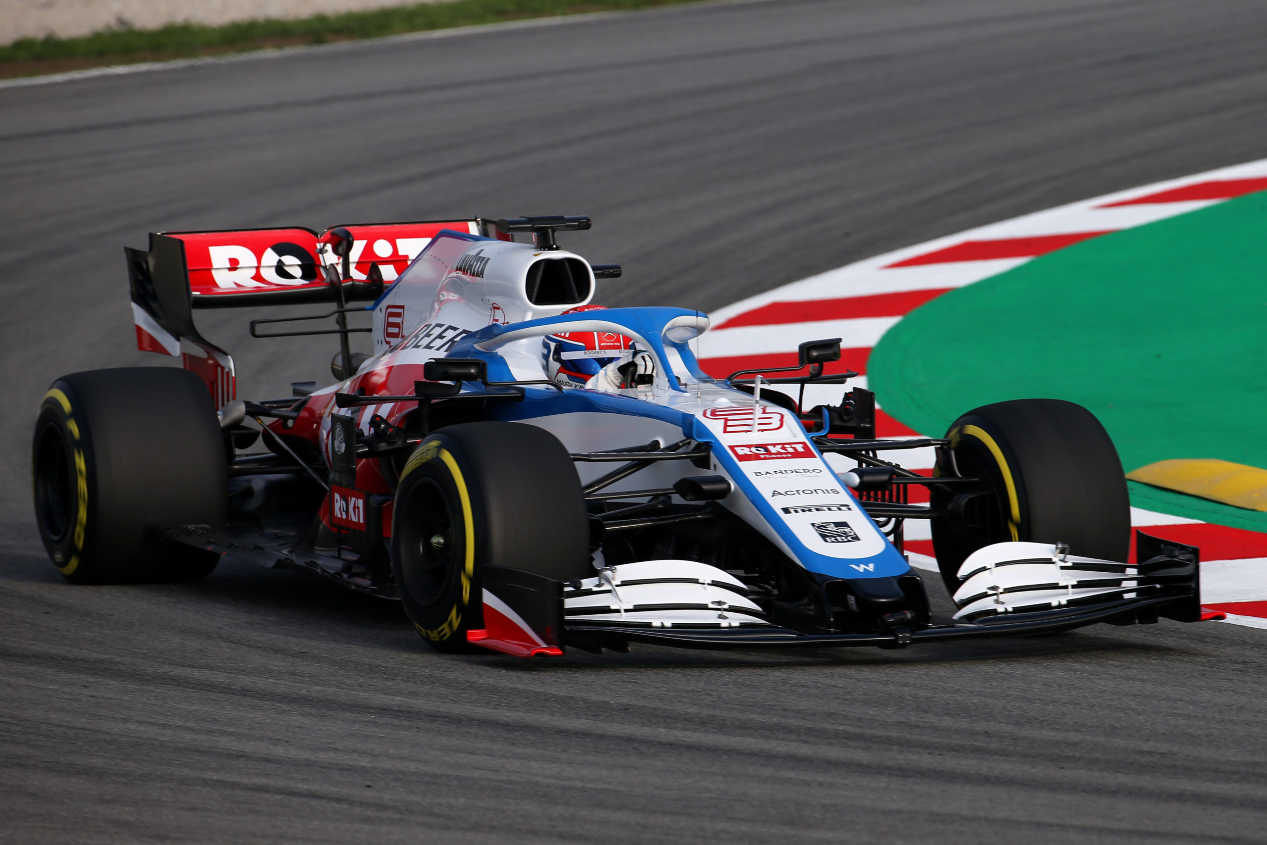
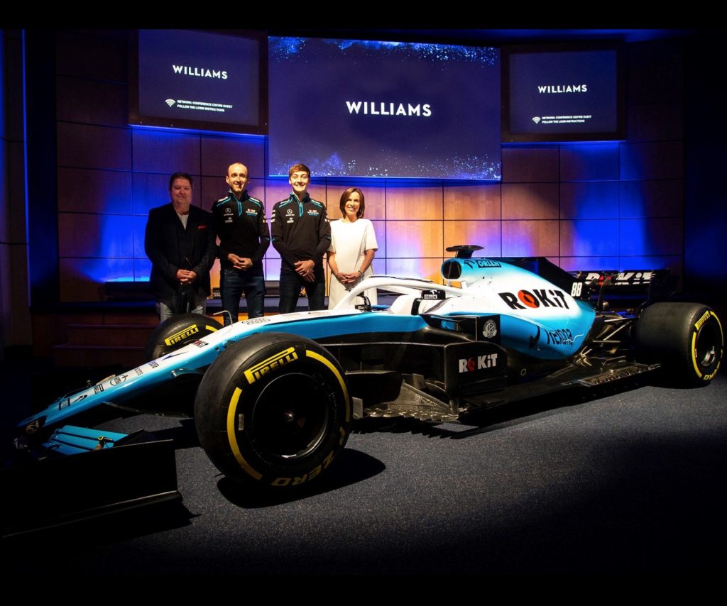
Williams Racing
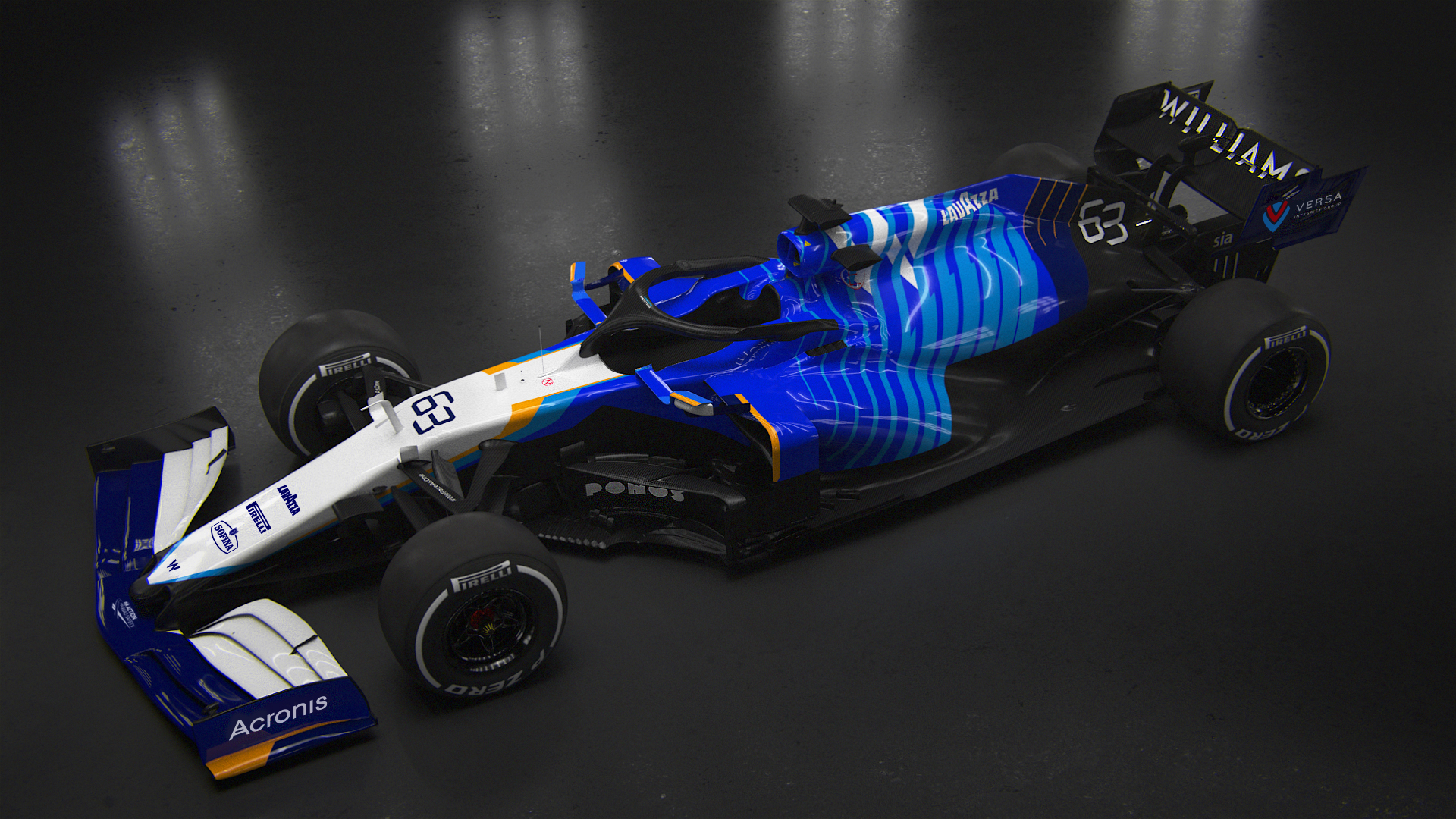
Williams had planned for an innovative VR launch of their new livery but, unfortunately, the app they were using was hacked and the designs leaked early. The response has been mixed but the blue, yellow and white is a nice nod to their infamous liveries in the early 90s.
True, the final design could perhaps have been improved – as shown by many armchair designers on Reddit – but it is a decent attempt at something different. Plus, it is always more difficult with the constraints of board executives and sponsors to please. It’s a shame BWT didn’t sign up with Williams and produce a blue-and-pink number akin to Damon Hill’s 1992 Brabham, perhaps. There is a lot of blue and white on this year’s grid…

&width=1300)